Image No. 21
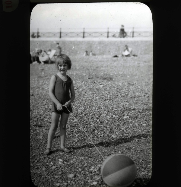
Subject: Margaret
Date:
Notes:
Image No. 22
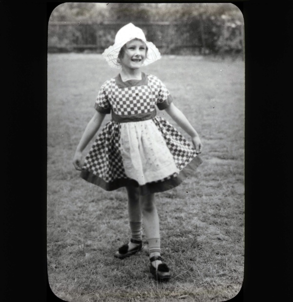
Subject: Margaret
Date:
Notes:
Image No. 23
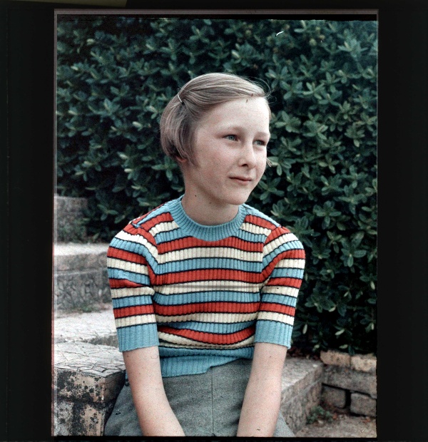
Subject: Margaret
Date:
Notes: (This original was an early colour slide and was very dark and showed a lurid colour balance. The above is I think amazingly good after being digitally colour balanced. – Steve)
Image No. 24
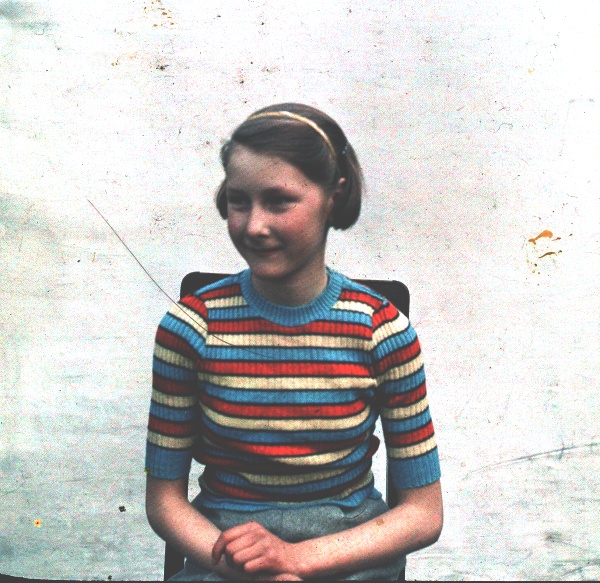
Subject: Margaret
Date:
Notes: As in the above example I have re-balanced the colour digitally and I think it looks better than the original.
Image No. 25
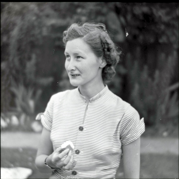
Subject: Margaret
Date:
Notes:
